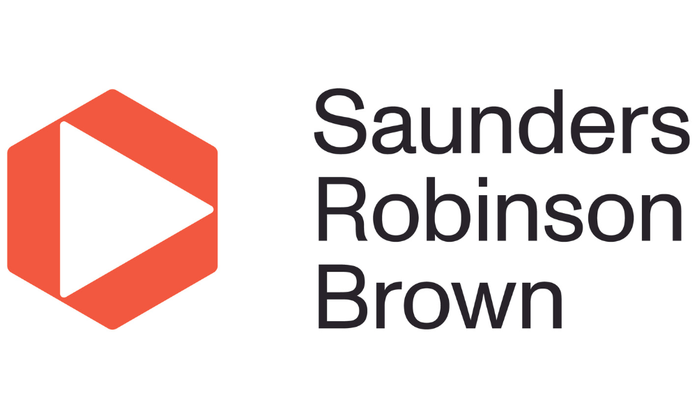
The Canterbury firm has developed a new visual identity representative of focus and progression

Saunders Robinson Brown (SRB) has announced a rebrand, with a new visual identity that the firm said is representative of focus and progression.
Managing partner Jonathan Gillard explained that the rebranding comes at a new stage in the firm’s journey, and was the result of both internal and external consultation.
“As part of our brand development we talked with both clients and staff about what they thought the SRB brand stood for. The territory in which we’ve landed is in line with our updated vision of ‘being the best at what we do and a great place to work’,” he said.
The firm plumped for a triangle as its visual identity to reflect its philosophy.
“Our new visual identity, the triangle, represents focus and progression. It supports the idea that we help our clients, irrespective of why they are working with us, to move forward and achieve their goals,” Gillard said. “As the foundation of our business, our clients and people sit at the heart of our triangle. Our other core values related to character, commitment and capability are represented by each point of the triangle.”
Christchurch-based design agency McCarthy Design led the redesign process. The rebrand took effect on 15 August.
“Linked to this concept we also help our people to progress and succeed in their careers, enabling them to thrive through our people-oriented workplace programmes,” Gillard said. “We have always prided ourselves on our people and client-centric culture. Our new brand and what it stands for builds on this. This is the start of a new chapter of momentum in the Saunders Robinson Brown story, and we are excited for the future.”