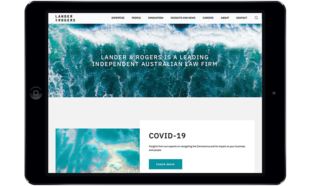
The firm’s new brand is based on three core values

Lander & Rogers has revealed a new look as part of its rebranding initiative.
On Monday, the firm debuted its new logo, brand assets and strategy, which the firm said expressed its vision “to ‘deliver the best Australian law firm experience’ for our clients and people, to support our communities and the environment and to drive positive change through innovation.”
The brand is based on Lander & Rogers’s three core values of “authentic, connected and innovative”—the values that underpin this vision, the firm said.
“Our new brand, developed in consultation with Lander & Rogers’s people and clients, is a reflection of who we are as a firm and what we stand for,” CEP Genevieve Collins said.
The firm said that the brand’s visual concept “combines four colourways and introduces a suite of striking photography and graphics, while retaining the firm's iconic orange.”
“The ampersand in Lander & Rogers creates a central motif, representing connection and evoking the firm's commitment to innovation and new ideas as it asks, ‘and—what's next?’ with no finishing line,” the firm said.
Collins also said that the rebranding reflects the firm’s identity as it continues its growth trend.
“Lander & Rogers is at an exciting stage: we are growing, diversifying our client offering, investing in new technology and designing new ways to deliver our legal and business services,” she said. “At the same time, the legal sector is evolving at an incredible speed and our clients are facing challenges and opportunities as never before. Our new brand and visual identity reflect our core identity and future focus.”
Collins said that the firm’s new look was “contemporary and vibrant, while also honouring our history, the strong authentic relationships we've built and the successes that have brought us to where we are today.”
Earlier this year, the firm unveiled its new website.